Images de style CSS
Apprenez à styliser des images à l'aide de CSS.
Images arrondies
Utilisez la border-radiuspropriété pour créer des images arrondies :

Exemple
Image arrondie :
img {
border-radius: 8px;
}
Exemple
Image encerclée :
img {
border-radius: 50%;
}
Images miniatures
Utilisez la borderpropriété pour créer des images miniatures.
Vignette :
Exemple
img {
border: 1px solid #ddd;
border-radius: 4px;
padding: 5px;
width: 150px;
}
<img src="paris.jpg"
alt="Paris">
Vignette sous forme de lien :

Exemple
img {
border: 1px solid #ddd;
border-radius: 4px;
padding: 5px;
width: 150px;
}
img:hover {
box-shadow: 0 0
2px 1px rgba(0, 140, 186, 0.5);
}
<a href="paris.jpg">
<img src="paris.jpg" alt="Paris">
</a>
Images réactives
Les images réactives s'ajusteront automatiquement pour s'adapter à la taille de l'écran.
Redimensionnez la fenêtre du navigateur pour voir l'effet :
Si vous souhaitez qu'une image soit réduite si nécessaire, mais jamais agrandie pour être plus grande que sa taille d'origine, ajoutez ce qui suit :
Exemple
img {
max-width: 100%;
height:
auto;
}
Conseil : En savoir plus sur la conception Web réactive dans notre didacticiel CSS RWD .
Centrer une image
Pour centrer une image, définissez les marges gauche et droite sur autoet transformez-la en blockélément :
Exemple
img {
display: block;
margin-left: auto;
margin-right: auto;
width: 50%;
}
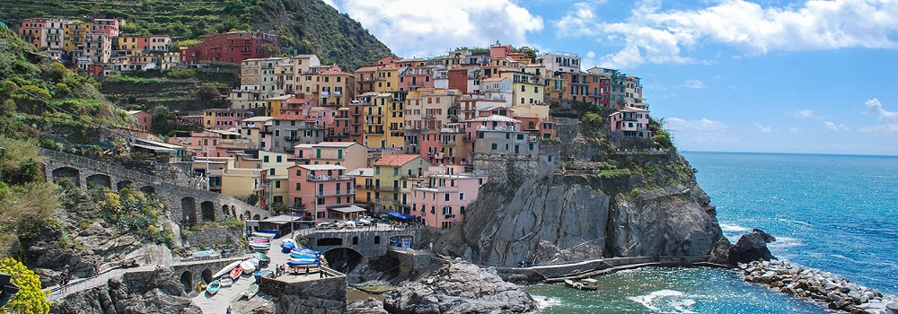
Images Polaroid / Cartes

Cinq terres

Aurores boréales
Exemple
div.polaroid {
width: 80%;
background-color: white;
box-shadow: 0 4px 8px 0 rgba(0,
0, 0, 0.2), 0 6px 20px 0 rgba(0, 0, 0, 0.19);
}
img {width: 100%}
div.container {
text-align: center;
padding: 10px 20px;
}
Image transparente
La opacitypropriété peut prendre une valeur comprise entre 0,0 et 1,0. Plus la valeur est faible, plus la transparence est grande :

opacité 0.2
opacity 0.5
opacity 1
(default)
Example
img {
opacity: 0.5;
}
Image Text
How to position text in an image:
Example
Try it Yourself:
Image Filters
The CSS filter property adds visual effects (like blur and saturation) to an element.
Note: The filter property is not supported in Internet Explorer or Edge 12.
Example
Change the color of all images to black and white (100% gray):
img {
filter: grayscale(100%);
}
Tip: Go to our CSS filter Reference to learn more about CSS filters.
Image Hover Overlay
Create an overlay effect on hover:
Example
Fade in text:
Example
Fade in a box:
Example
Slide in (top):
Example
Slide in (bottom):
Example
Slide in (left):
Example
Slide in (right):
Flip an Image
Move your mouse over the image:
Example
img:hover {
transform: scaleX(-1);
}
Responsive Image Gallery
CSS can be used to create image galleries. This example use media queries to re-arrange the images on different screen sizes. Resize the browser window to see the effect:


Example
.responsive {
padding: 0 6px;
float: left;
width: 24.99999%;
}
@media only screen and
(max-width: 700px){
.responsive {
width: 49.99999%;
margin: 6px
0;
}
}
@media only screen and (max-width: 500px){
.responsive {
width: 100%;
}
}
Tip: Read more about Responsive Web Design in our CSS RWD Tutorial.
Image Modal (Advanced)
This is an example to demonstrate how CSS and JavaScript can work together.
First, use CSS to create a modal window (dialog box), and hide it by default.
Then, use a JavaScript to show the modal window and to display the image inside the modal, when a user clicks on the image:

Example
// Get the modal
var modal = document.getElementById('myModal');
// Get the image and insert it
inside the modal - use its "alt" text as a caption
var img =
document.getElementById('myImg');
var modalImg = document.getElementById("img01");
var captionText = document.getElementById("caption");
img.onclick =
function(){
modal.style.display = "block";
modalImg.src = this.src;
captionText.innerHTML = this.alt;
}
// Get the <span> element that closes the modal
var span =
document.getElementsByClassName("close")[0];
// When the user clicks
on <span> (x), close the modal
span.onclick = function() {
modal.style.display = "none";
}